Stay in Connection With The Package: How Can Your Packaging Develop Your Brand?
In addition to sectoral developments, it is of great importance in terms of development to keep up with these developments in the new world where technology is developing a lot of Technological developments, which are also integrated into the packaging industry, are known to help brands gain value and increase brand awareness. You can adapt to technology with your packaging in the new communication age, where the information age is rapidly developing and consumer solidarity is getting stronger.
By adding the information of your product, how it is produced, its benefits or the situations that you want to get feedback from, with smart labels, you can establish a reliable and transparent communication and benefit from the benefits of this system.
So What Are These Smart Packaging?
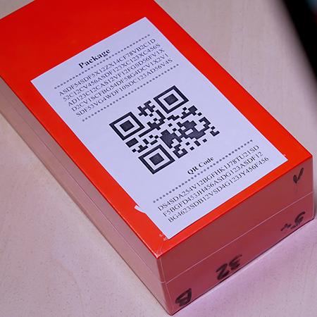
Smart packagings are packaging systems that provide information to producers and consumers in the context of food safety and quality, and to inform them about product quality. The smart packaging system, which has functions such as determining, perceiving, monitoring and communicating, helps you to approach your customers with more sincere communication beyond a classical packaging. Factors such as QR Codes, Barcode labels are frequently used systems in smart packaging.
Reliability and Smart Packaging
Reliability is one of the concepts that a customer values when purchasing. Customers who want to have information about the product cannot access this information easily, especially in a period when the information stack is high. Smart packaging can be cited as an example of this situation. Because with the codes or barcodes to be integrated into the packages with certain systems, the customer will be in a position to reach this information easily by using the technology. These methods, which are frequently used by the leading brands of the sector, create a bridge of trust between the consumer and the brand, as well as have the capacity to increase brand loyalty.
The Role of Packaging in Brand Loyalty
Of course, if you want your product to stand out among many brands and products or to appeal directly to the consumer, you should consider packaging, which is one of the most important factors. Packages that are beneficial in terms of the presentation can rank first among the details that attract the attention of the consumer with their structure and content. Many customers want to have information about how the product they use is produced and what is in its content. This information can be quickly transferred to customers with the help of a code or barcode on the package. In this way, brands can easily convey their transparency and reliability to their target audiences through such methods and can help improve brand loyalty.
Smart Packaging and Increase in Preferences
While establishing a reliable communication and brand loyalty is ensured by packaging and smart tags, your customer's positioning of your brand will be positive. In this way, your preference rate will increase as well as increase in memorability. Brand-consumer relationships based on trust will be more prone to be easily noticed and preferred among other brands.
Smart Label Examples That Can Be Used In Packaging
Barcode Method: Barcode is a marking method consisting of parallel vertical lines of various thicknesses and spaces of various widths in order to define the type and characteristics of the product, in which country and enterprise a unit of the good is produced or packaged. The barcode system, which provides convenience in many aspects such as developing a sense of trust and realizing the flow of information, can now be read from many smartphones and easily presents the information to be given to the consumer as a result of the necessary guidance.
QR Code System: When the phone is read, the information to be given can be easily transmitted to the other party. In this way, you can easily find out how many people react from the labels created with the QR Code. QR Code, which stands for "Quick Response" and translated into Turkish as "Çabuk Tepki", is one of the most preferred technologies with the widespread use of mobile phones. QR Code is among the first preferred methods for data sharing in the digital world. When QR Codes are read on smartphones, the information to be given can be easily transmitted to the other party. In this way, you can easily find out how many people react from the labels created with the QR Code.
NFC System: NFC System is a system that has just been integrated into the packaging industry, but it is not as common as QR Codes. Considering its features, it is seen that it provides easier access than other smart tags. With NFC, it is enough to just touch your phone that supports technology to the product. Thanks to a passive chip placed on the package, a lot of information about the product can be obtained by touching mobile devices. This technology is ambitious to be a technology we will see frequently in the future, surpassing other smart tags in terms of time and speed.
Switch to Smart Packaging with LuxBoxPack
If you have a smart packaging project, contact us immediately as LuxBoxPack! Our packaging experts will work with you to design smart packaging projects that engage your customers and create value for them.
...
