Packaging design is the first point of contact between a product and the consumer. In purchase decisions made within just a few seconds at the shelf, color stands out as one of the most decisive elements. Yet despite this power, the use of color also brings with it one of the most common mistakes in packaging design: excessive color saturation. Intense and dominant colors chosen to attract attention at first glance often weaken the product’s perceived value and blur the clarity of its message.
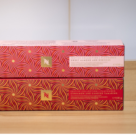
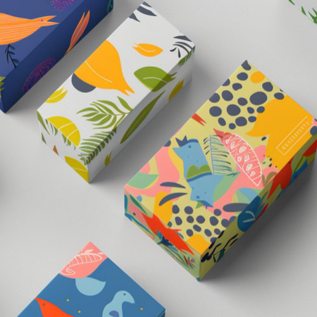
Color saturation refers to the degree of purity and intensity of a color. Highly saturated colors create a vivid, energetic, and striking effect, while lower saturation conveys a softer, more balanced, and sophisticated perception. In packaging design, problems arise when a conscious balance between these two extremes is not established. Packaging created with overly saturated colors produces visual noise rather than expressing the product’s character. The consumer struggles to determine where to look, and the core message the packaging intends to communicate fades into the background.
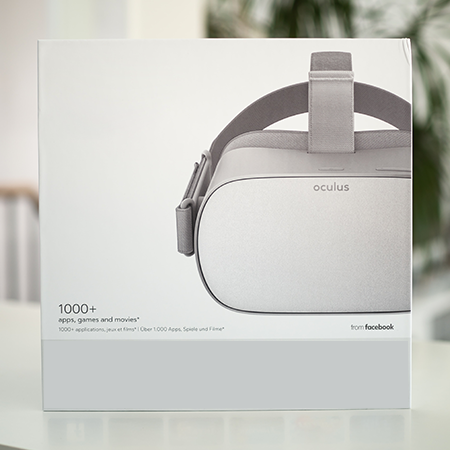
Another significant issue is the alignment of color saturation with the target audience. Every product requires a different color language depending on the user profile it addresses. While vibrant colors may be acceptable for everyday consumer goods, this approach often has the opposite effect for premium or technical products. Excessively bright and intense colors can trigger negative subconscious associations regarding product quality, causing the packaging to diminish rather than enhance the product’s perceived value.
Mistakes in color saturation are not limited to aesthetics - they also have serious implications for readability and perception management. When sufficient contrast is not achieved between background colors and typography, product information recedes into the background. Especially on small packaging surfaces, heavy use of intense colors makes text and icons harder to perceive, preventing consumers from accessing accurate and quick information about the product.
Achieving the right level of color saturation in packaging design requires conscious simplification. Rather than covering the entire surface with dominant colors, strategically defining areas of emphasis yields far more effective results. Saturated colors balanced with neutral tones both attract attention and avoid visual fatigue. In this way, packaging speaks without shouting, presenting a strong stance without striving to be overtly assertive.
In summary, color saturation in packaging should not be approached with a “more is better” mindset, but with a focus on measure and balance. Packaging that strengthens the first impression uses color not merely to attract attention, but to convey the right message in the right tone. Thoughtful color decisions transform packaging from a simple design surface into a powerful communication tool.
At LuxBoxPack, we provide packaging solutions tailored to the evolving needs of our clients in different sectors. Contact us at +90 212 438 82 15 to get detailed information about our product range.