As each country has its own culture, this culture has different elements as well. As these can appear as food, clothing, or music, many other phenomena have become symbols of countries. When we think of the facts that best describe Belgium, we come across chocolates with unforgettable flavors. These chocolates are known almost all over the world and are frequently consumed by tourists visiting Belgium.
In Belgium, it is very important that chocolates have eye-catching packaging as well as their flavors. So what are the main elements in the packaging of these chocolates? The patterns and colors used in Belgium's chocolate packaging actually have many meanings. In this article, we have compiled the colors and meanings of chocolate boxes, which are especially preferred in the e-commerce sector in Belgium. If you want to choose the best color for your LuxBoxPack packaging, you can take advantage of this article.
The Importance and Communication of Colors
Especially due to the expansion of the e-commerce sector, the importance of differentiation of brands in the sector is increasing. While the bond between the brand and the customer develops according to the eye-catching of the first box opening experience, the colors of LuxBoxPack packaging designs are updated accordingly.
When we examine many types of research and experiments on colors, we can conclude that colors are effective on people's sense of smell and taste. This determination shows that attention should be paid to colors, especially in food packaging designs. Therefore, the correct selection and use of colors in design is an important step for your brand.
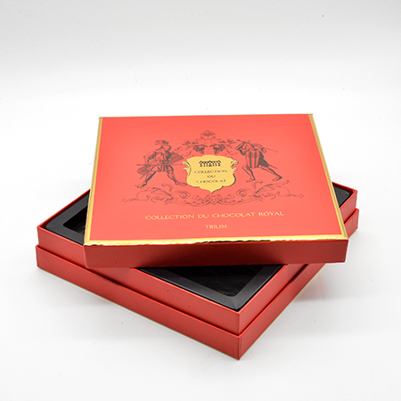
Reflecting the Color of Red on the Boxes
A dynamic color, red represents movement, assertiveness, leadership, and strength. As red is a color that accelerates blood flow and increases the heart rate, brands often use red in product packaging, as it triggers excitement. As we mentioned before, the first moment of communication between brands and customers is the unboxing experience. If you want to excite your customers during the unboxing experience, we recommend you use the red color in your LuxBoxPack packaging.
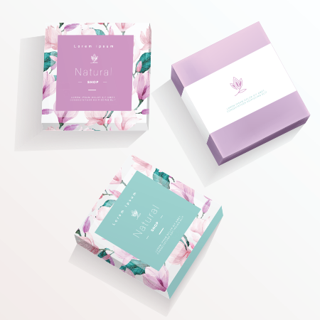
Supporting Effect of White Color
The symbol of cleanliness, brightness, simplicity, and innocence, white is especially indispensable for the giftware industry. White, which creates a clean and stylish perception, can easily adapt to most products and packages. In addition, because the human eye immediately detects the white color, this color is famous for its frequent use in signs, packages, and sales stands. If you want your packages to attract attention with LuxBoxPack, you can focus on white in your designs.
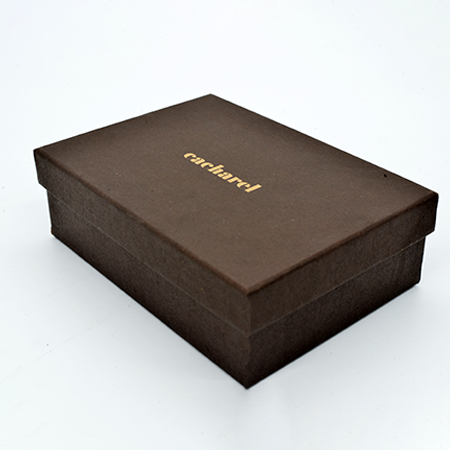
Frequent Use of Brown
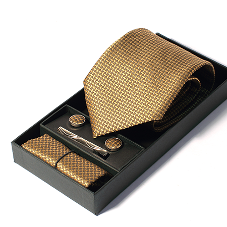
Brown is known as the symbol of consistency, continuity, and wealth. This color, which we often see in Belgium's chocolate boxes, has a meaning that gives people confidence because it is an earthy color. This color, which is used in the home and food sector, is frequently used in the packaging of food products, as it reflects elegance in the best way. With LuxBoxPack, you can increase your brand perception by including brown in your packaging.
Increase Your Brand Value By Using The Right Colors In Your Designs With LuxBoxPack
You can differentiate your brand in the sector while increasing your brand value by following the packaging trends of European countries such as Belgium. If you are curious about the best quality packaging solutions for your brand, contact the LuxBoxPack expert team immediately!