
Packaging design is not merely the aesthetic surface of a product - it is one of the first and most powerful points of communication between a brand and the consumer. One of the most effective tools of this communication is color. Colors trigger emotions, shape perception, and directly influence purchasing decisions. However, the meaning of colors is not universal. Color choices made without regard for cultural context can turn even well-intentioned designs into communication failures. For this reason, color selection in packaging design requires cultural awareness as much as aesthetic sensitivity.
One of the most common causes of cultural color mistakes is assuming that the meanings a color carries in one geography are universally accepted. In reality, the same color can evoke completely opposite associations in different cultures. For example, while white is associated with purity, cleanliness, and innocence in Western cultures, it may be linked to mourning and grief in some Asian countries. When this context is ignored, especially for products introduced to global markets, packaging colors can generate emotions that are the exact opposite of those intended.
Similarly, the color red signifies energy, passion, and attention-grabbing qualities in many Western countries, while in some Middle Eastern and African cultures, it may be associated with danger, warning, or negative emotions. Red tones used in food packaging to stimulate appetite can create discomfort for consumers when applied within an inappropriate cultural context. That weakens product perception and negatively affects trust in the brand.
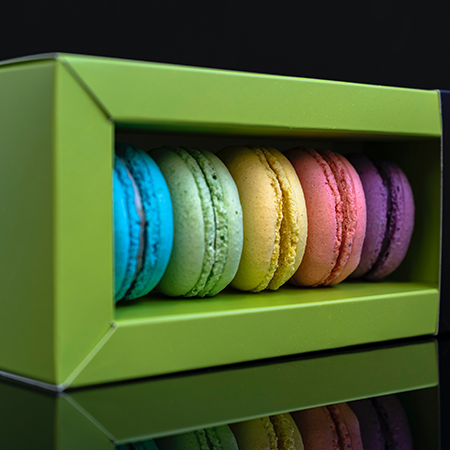
Green is frequently chosen by brands seeking to emphasize sustainability and naturalness. However, in certain regions where green carries religious, political, or ideological connotations, this choice may produce unintended meanings. Likewise, while purple is associated with nobility and luxury in some cultures, in others it may evoke mourning or melancholy. When such nuances are overlooked, packaging design drifts away from the message the brand intends to convey.
Another source of cultural color mistakes is the insufficient analysis of the target audience’s demographic and sociological structure. Factors such as age, education level, lifestyle, and local habits directly influence color perception. Even within the same country, the meanings attributed to colors can vary across regions or generations. Therefore, designs created with the assumption of a “uniform consumer” risk remaining superficial in communication.
To prevent such mistakes, cultural research, local market analysis, and, when necessary, expert consultation are of great importance in the packaging design process. Color selection should be approached not merely as a graphic preference, but as a strategic communication decision. Testing studies, focus group analyses, and local feedback help identify potential misinterpretations at an early stage.
In short, color in packaging design is a powerful narrative tool; however, when used independently of cultural context, this power can turn into a disadvantage. Avoiding cultural color mistakes is one of the fundamental requirements for brands to establish communication that is not only aesthetic but also respectful, informed, and effective.
At LuxBoxPack, we provide packaging solutions tailored to the evolving needs of our clients in different sectors. Contact us at +90 212 438 82 15 to get detailed information about our product range.