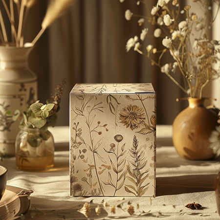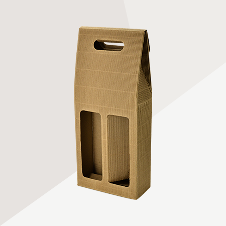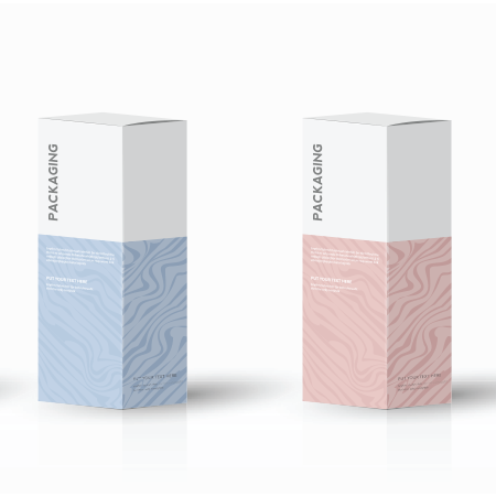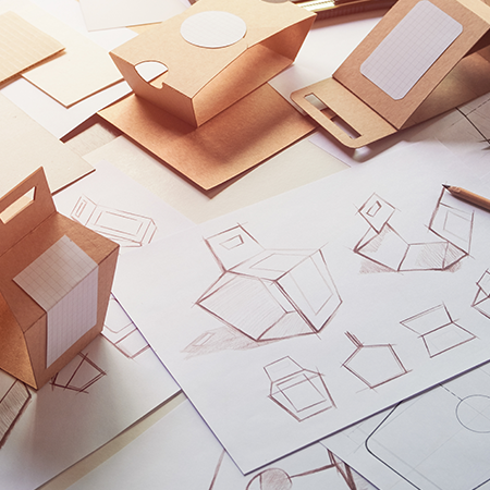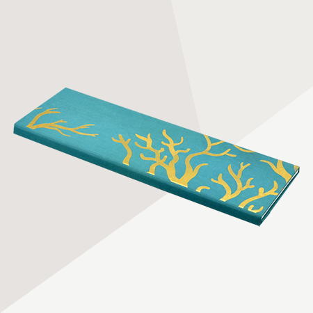
If you want to make a great first impression, give magnetic luxury boxes a chance! These are designed to showcase your product in a spectacular manner. They create a sleek and notable unboxing experience, therefore making your product special for the customer. Even the click of the magnet can create a memorable effect.
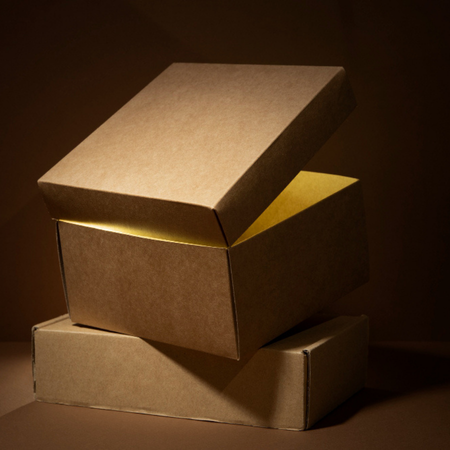
The construction of magnetic luxury boxes makes them especially durable. They are made from grey board and laminated with cellophane for the luxury look. Optionally, hotfoil stamping can be done. The magnet protects your product, and it can be closed and opened safely repeatedly. No matter what your product is, magnetic luxury box is a great choice.