We live in a global world where every trend is short-lived and consumed quickly. Contrary to all, there is a design trend that has not lost its effect for many years, “Retro”. Although retro-style nostalgic designs have been under the influence of many areas such as decoration and clothing for a long time, we can now see the effects in packaging and wrapping designs. It is a matter of curiosity why people attach so much importance to nostalgic designs. Although some interpret it as the longing of the society for the past, it is mostly that retro designs appeal to the eyes and emotions. Especially the nostalgic works of famous brands have always been appreciated by the X and Y generations. When he sees the packaging of a beverage he always drinks from his childhood, he remembers his childhood and establishes an emotional bond with the brand.
You shouldn't just look at it emotionally. Because of the simplicity of retro designs, the packaging, and wrapping that prioritizes the product appeals to people's eyes. When this form of address is combined with special feelings, it also positively affects people's purchasing tendencies.
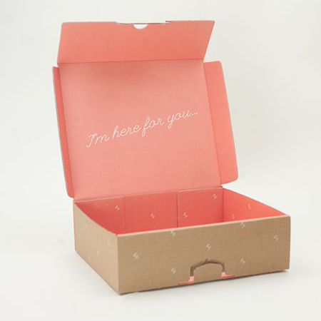
HIGHLIGHTS OF RETRO PACKAGING AND WRAPPING DESIGNS
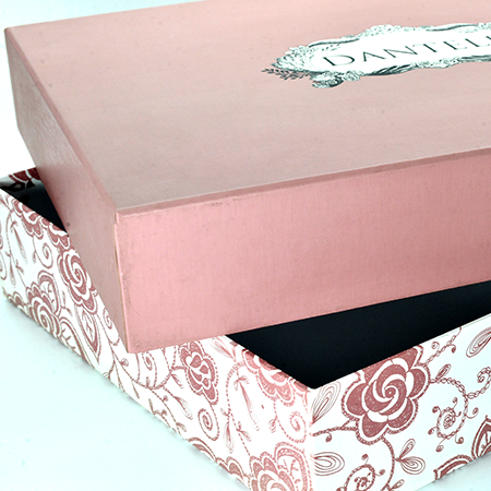
Simplicity is the most important element of retro designs. If you combine your plain design with the right colors and retro fonts, you will get a good result. The retro atmosphere you will add to the packaging and wrapping design will be welcomed positively and sympathetically by your customers. In your designs, you can reflect the retro atmosphere not only in form but also in print forms. Creative designs such as pop art prints can add an 80's and 90's feel to your packaging and wrapping. Thanks to pop art prints, you can add simplicity, retro air, and sympathy to your packages.
BE SIMPLE AND DIFFERENT
Being simple in packaging and wrapping designs will not be enough on its own. It is the most important requirement to be different from competing brands while being simple. Your consumer should not be saying, “This package is the same as the brand…”. While following the trends in the global world, being different from them will always add +1 to your household.
COLOR CHOICES IN RETRO DESIGNS
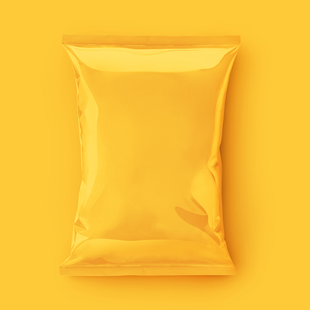
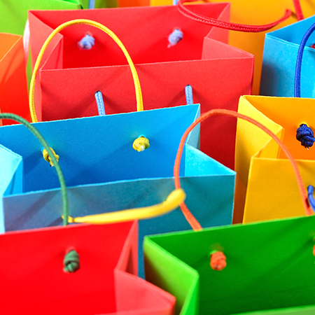
Although the most intense color we can see in nostalgic designs is yellow, brown tones also occupy an important place. It is necessary to use these colors and tones in your packaging and wrapping designs to capture the retro atmosphere. If you intend to use designs such as pop art in your packages, you should use a print design with heavy yellow, red and blue colors.
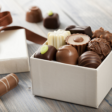
ADD A DIFFERENT AIR TO YOUR PACKAGING DESIGNS WITH LUXBOXPACK!
We are ready to support you with special ideas for any design you want. Increase the value of your brand with LuxBoxPack, with quality printing options and products with all kinds of designs. Contact the LuxBoxPack expert team to get information about designs specific to your brand!