When designing your packaging you may want to spruce things up, and that’s actually a good thing, but the last thing you need is too much flashiness. Just the right amount will do the trick.
If someone asked you "what's your favorite packaging? what would you say?
Will it be a normal box? A rectangular tea box? A shoebox? Likely not.
I bet you'd remember something special, a packaging design that was an experience for you.
A package that made you fall even more in love with the product than you would imagine.
This is what we mean by saying that packaging is a silent salesman.
Designing a box that will be so unforgettable, though, isn't easy. There are ways to embellish your packaging and this is the right place to be if you are looking for them.
Novelties on the surface
Human beings have an extremely powerful sense of touch. Although most research suggests sight is an essential sense for us, touch is by no means less important.
On the opposite, touch plays an incredibly important part in packaging. Each customer gets a box and immediately assesses its surface, its texture. Is it smooth? Is it sticky? Does the imprint wash off?
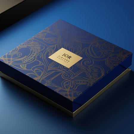
Addressing touch sensation isn't a vague concept. Most of the latest packaging designs use embossing and debossing, different foils and textures to enrich a box 's touching experience. Embossing on the packaging surface is also quickly associated with luxury.
A prolonged experience
Most brands lose time between placing an order and delivery. A customer should anticipate the package, like a child on the Christmas Day.
The other aspect builds upon the moment a box is opened. You should not hesitate to show off your product with better security, wrapped in loads of bubble wrap. Respect your client, let them carve their own first impression. Use a layer of translucent material, add a dedicated note on top of the product. Prolong the journey and see your customer more satisfied than ever.
A zesty design
The word "zesty" means energetic and eager to live.
That's exactly what your product should be saying (apart from every other feature) - you chose to be full of life by selecting our brand.
If you think this is a cliche, be mindful of the strong influence of colors and contrasts on your clients.
If you're bland and unspirited, that’s the impression of your customers. If you play with fire and throw too many graphics and kitschy fonts, your customers will see something’s off.
A zesty design doesn’t mean going crazy. A minimalist design can be zesty too.
Lightness
Have you ever been struck by the fact that heavy packages can give a headache? Most significantly, they increase the risk of damage during delivery.
Not every product can be light - some goods are heavy, and there is no way around it. You shouldn't add excessive weight to your packaging though. A metal decoration attached to the box can look extravagant, but the final weight will be affected too. Eventually, the client won't appreciate the effort, as his lifting efforts will be even more important.
Use packaging add-ons that look fine, but do not ask your customers to test their back’s strength.
There you go, these are some packaging elements that you can focus on.
Note that not all of our ideas need to be implemented. Choose only one thing-maybe work on the design of your box, order a set of new boxes and see what it brings you? A bit of rebranding can rejuvenate your look.
We will be happy to assist you with your inquiry. Tell us your needs and our team will be back with details
