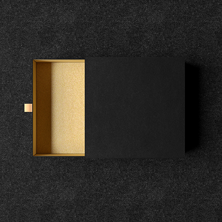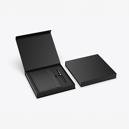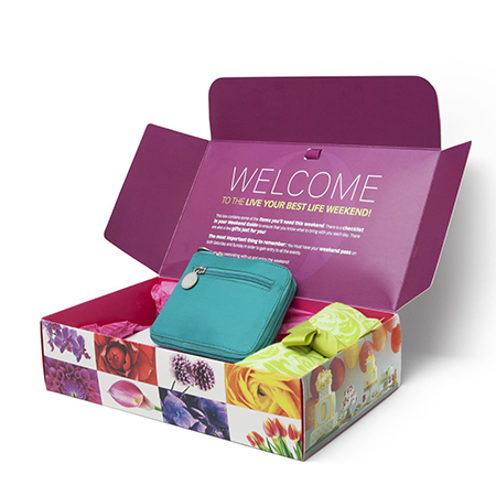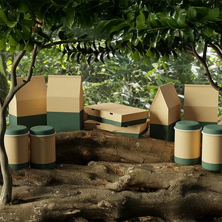
Customers' perceptions of your brand and the quality of your goods are strongly influenced by the packaging and product box designs you use. The text that appears on your packaging and boxes is one of the most crucial elements of your designs. When creating packaging, it is critical to strike a balance between all of the aesthetic features. Typography is one of the elements that contribute to the definition of balance. In this blog post, we will focus on the importance of typography and packaging.
What is Typography?
To put it simply, typography is an art that deals with the arrangement of letters and words in a manner that makes the content intelligible and aesthetically beautiful. Typography is a form of visual communication that enhances the readability of written text. When it comes to reaching out to consumers, typography may be an invaluable tool.
Typography and packaging
Packaging design relies heavily on typography since it helps to keep the visual and textual aspects in harmony. It is difficult to reduce the amount of writing on packaging since it conveys so much information about the product. As an alternative, we may depict the words in a visually appealing manner to match the box design.
After comprehensive research, the demands and desires of your clients may be addressed in the design of your packages. These design techniques might be derived from past studies and thorough market research. The package's size and shape also come into play while creating these strategies. You may entice buyers by designing your packaging with a feeling of harmony and symmetry.
Little tips on typography and packaging
- Avoid using too many words or typefaces in the design of your product, since this might make it seem crowded and confusing. By changing the fonts you choose, you can strike a delicate balance between contrast and uniformity.
- When uppercase and lowercase letters are blended, the human eye has an easier time recognizing them. This may increase the pace at which clients obtain Access to information.
Reading black text against a light background causes the letters to appear smaller than they are; conversely, reading white text against a dark background causes the letters to appear larger. This is an excellent strategy for space optimization when dealing with smaller products.
Conclusion
Numerous fonts generally arise based on the industry, product size, and intended audience. Globally, trends in minimal, vintage, and retro font packaging have evolved in recent years. If you want to draw attention to your brand and product straightaway, let your typographic art speak for itself on the LuxBoxPack boxes of your choosing, along with the minor pointers we've discussed.