Colors play a significant role in our lives, both emotionally and visually. The feelings they evoke can vary across different cultures and languages. In this blog post, we will take you on an intriguing journey into the captivating world of summer colors used in boxes and packaging.
Boxes and packaging are vital elements that reflect the presentation and brand image of products. Summer colors are strategically chosen to grab customers' attention and create an emotional connection with the products. Here are some interesting summer colors and their meanings:
Vibrant Orange: Orange evokes a sense of energy and liveliness. It is used to create an energetic atmosphere during the summer season and is often preferred for products like fruit juices or beach accessories.
Fresh Green: Green represents nature and symbolizes freshness and renewal. It instills a sense of freshness and novelty during the summer months. It is a preferred color for packaging organic and natural products.
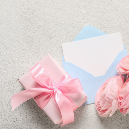
Warm Pink: Pink is associated with romance and femininity. It can be used in beauty and cosmetic products during the summer to create a romantic atmosphere.
Bright Yellow: Yellow represents the energy and cheerfulness of the sun. It is frequently used in summer products related to holidays and entertainment. It is a preferred color for items like sunscreen or beach towels.
Sea Blue: Blue invokes a sense of calmness and tranquility associated with the sea and the sky. It is preferred for packaging beachwear, seafood products, and vacation-themed items.
Vibrant Red: Red represents passion and energy. It is used to create a striking impact during the summer months. It is often preferred for packaging beverages or ice cream.
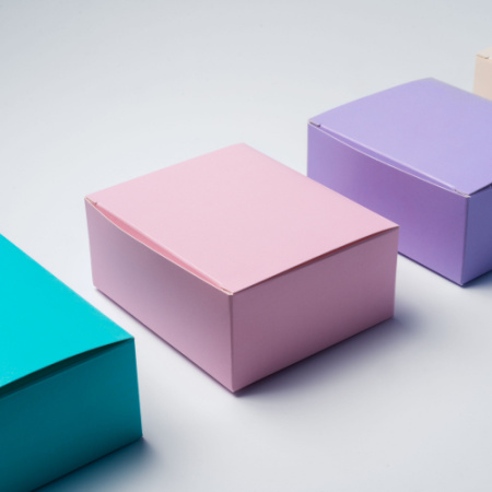
Pastel Tones: Soft and gentle pastel colors are also popular during the summer. Colors like powder pink, lavender, and mint green are chosen to create a sweet and peaceful atmosphere.
Colors play an important role in increasing product sales and strengthening brand image. Additionally, they have different effects on consumers based on the atmosphere and emotional connection. For example, vibrant and energetic colors reflect the joy and energy of summer, while calm and pastel tones can evoke a peaceful and relaxing atmosphere.
However, color selection should also be aligned with the brand's identity. Brands should consider factors such as their target audience preferences, brand values, and unique product characteristics when choosing colors for their boxes and packaging. For instance, a natural and organic cosmetic brand may opt for green and natural tones, while a luxury brand may lean towards sophisticated and glamorous colors.
In conclusion, the summer colors used in boxes and packaging are significant elements that enhance the presentation and communication of products for brands. Colors create emotional effects on consumers while also reflecting the brand's identity and establishing a connection with the target audience. Therefore, color selection is a strategic decision for brands and should be utilized as an effective marketing tool. If you wish to use packaging in colors suitable for your products, you can explore the wide range of product categories offered by LuxBoxPack.

