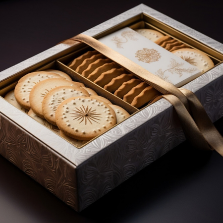

The lighting conditions products are exposed to in retail environments directly affect how packaging design is perceived. On shelves with particularly low lighting, colors, text, and graphic elements can become more difficult to distinguish. For this reason, packaging design should take into account not only how it appears under daylight or strong store lighting, but also how it performs across different levels of illumination.
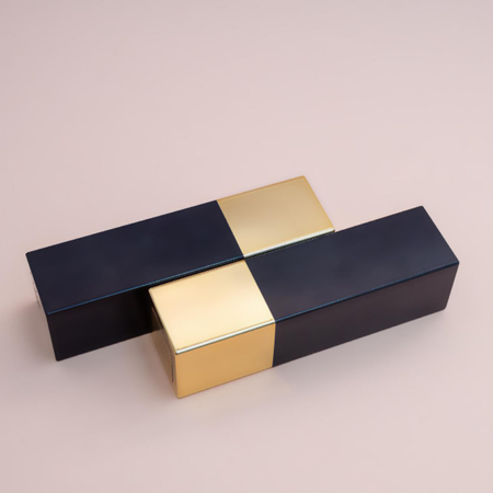
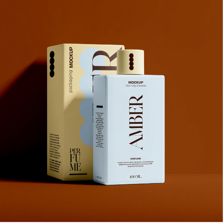
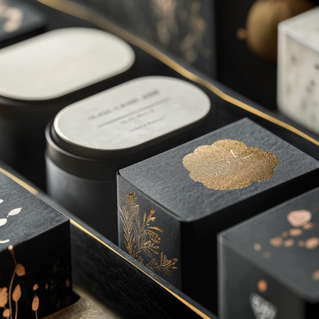
One of the key factors determining visibility in low-light environments is contrast. Ensuring sufficient differentiation between the packaging surface and its graphics in terms of color and brightness can make the design easier to notice. Using light-colored details against a dark background can further enhance this effect. However, rather than focusing solely on color selection, it is also important to consider how the surface interacts with light.
Fluorescent colors are one of the applications that can be considered to increase visual impact on low-light shelves. When used in specific graphic areas or limited design details, fluorescent tones can stand out against surrounding colors with lower brightness and create a visual focal point. The aim in such applications is not to cover the entire package in an intense color, but to direct the consumer’s gaze toward specific areas.
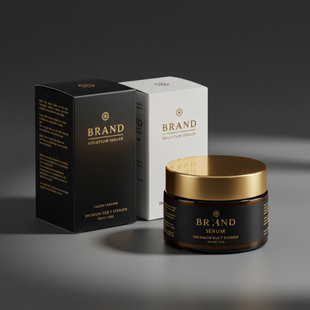
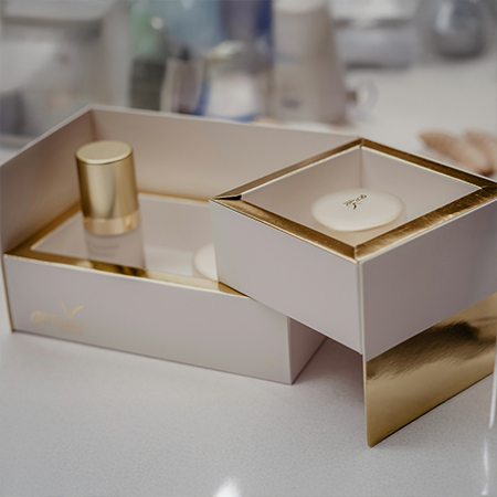
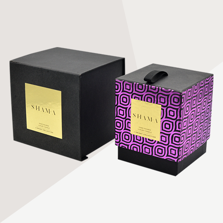
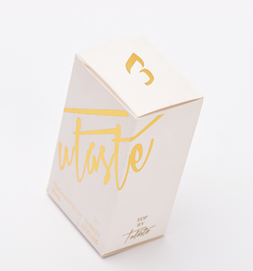
Foil stamping can also contribute to the way packaging is perceived by creating a different interaction with light. Since metallic surfaces reflect a certain amount of the light that falls on them rather than absorbing it entirely, they can create a dynamic and eye-catching surface effect in environments where shelf lighting varies. Using gold, silver, or other metallic tones in logos, patterns, or typographic details can help certain areas of the packaging stand out.
In addition, surfaces that reflect light at different angles and specialized color applications can also be considered under low-light conditions. The balanced use of glossy and matte surfaces within the same design can create different visual layers under lighting. However, overly glossy surfaces may produce unwanted reflections and reduce legibility. Therefore, such applications should be evaluated as part of the packaging’s overall visual hierarchy.
In summary, successful packaging design for dark shelves is not simply about being brighter or more colorful. Considering contrast, surface texture, reflectivity, color intensity, and graphic hierarchy together can help packaging maintain a more consistent visual presence under different lighting conditions. In this way, the design can retain its visibility on shelves where light is limited while guiding the consumer’s attention toward the right areas without compromising its overall visual integrity.
At LuxBoxPack, we provide packaging solutions tailored to the evolving needs of our clients in different sectors. Contact us at +90 212 438 82 15 to get detailed information about our product range.