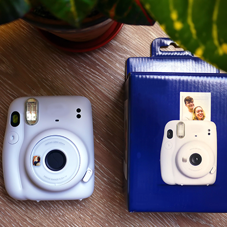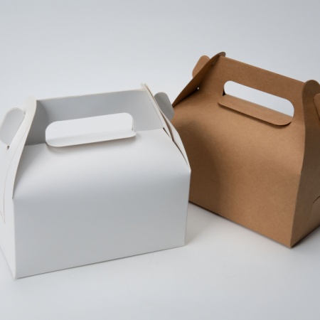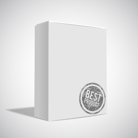
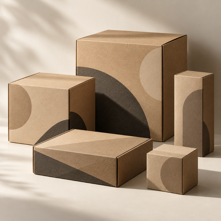

Creating visual impact in packaging design does not always require complex graphics, bold colours, or three-dimensional surfaces. The deliberate use of light and shadow can create a sense of depth even on flat surfaces, changing how a design is perceived. This approach offers a way to give packaging a more layered and balanced appearance while preserving visual simplicity.
The perception of shadow and depth is closely related to how people interpret the objects around them. The distribution of light across surfaces, the positioning of objects, and the contrast between them all influence the perception of visual volume. In packaging design, these elements can make a physically flat surface appear more dynamic, tactile, or three-dimensional.
How Is Visual Depth Created?
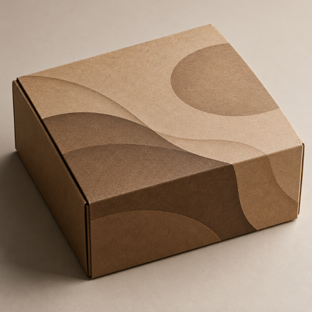
One of the primary tools for creating a sense of depth on flat packaging surfaces is the relationship between light and dark areas. Variations in tone across specific areas of a graphic element can make it appear as though it is raised above the surface or receding into it. Soft transitions create a more natural sense of volume, while sharp contrasts can produce a more pronounced and dynamic effect.
The direction of the shadow also plays an important role in this perception. When the position of the light source is represented consistently, visual coherence can be maintained across design elements. Conversely, conflicting shadow directions can make individual elements appear disconnected from one another. For this reason, the use of shadow should be planned with the overall design in mind rather than considered in isolation for each graphic element.
The Role of Shadow in Minimalist Designs
In minimalist packaging, even subtle tonal variations can become noticeable because relatively few visual elements are used. Soft shadows combined with generous negative space, simple typography, and restrained colour palettes can reinforce the visual hierarchy of a design. This makes it possible to emphasise specific areas without overcrowding the surface.
However, the intensity and form of shadows should be consistent with the product category the packaging serves. Hard, defined shadows create strong contrast, while softer shadows can convey a more understated aesthetic. Excessive use of shadow, on the other hand, may make the design appear cluttered and cause the primary message to recede into the background.
Enhancing Visual Impact Through Printing Techniques
How shadow and depth effects created in digital design appear on printed packaging depends on the printing technique, the properties of the paper or cardboard, and the surface finish. Subtle tonal transitions that appear distinct on screen may not reproduce with the same clarity in print. For this reason, colour contrast, level of detail, and surface characteristics should be evaluated together.
In short, the use of shadow and depth can create a perception of volume on flat packaging surfaces without adding physical embossing. Successful implementation treats visual effects not merely as decorative elements, but as part of a cohesive approach to the interplay between light, contrast, typography, and composition.
At LuxBoxPack, we provide packaging solutions tailored to the evolving needs of our clients in different sectors. Contact us at +90 212 438 82 15 to get detailed information about our product range.