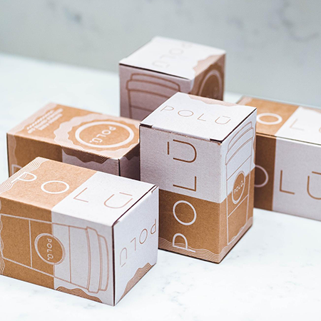
The use of vintage style in designs created by many different sectors is becoming increasingly common nowadays. Brands with an earlier date of establishment capitalize on this situation by instilling trust in their customers as a result of their long-term market position. Older people, in particular, witness the change and development of their own lives, as well as the concurrent changes in the concrete and dynamic products of the world in which they live. Thus, it has been observed that brands whose visuality is at the forefront both put forward on the market the designs they created in the past, and those that will be re-created using the vintage style are more appreciated by customers. As a result, almost every industry and brand that wants to capture the mood has recently reshaped their products in a retro style. So, what exactly is this style?
Retro style refers to the visual perceptions created by trends, styles, and movements that were shown, used, and popular during a specific period in history.
The perception of timelessness created by the brand is one of the factors that causes vintage styles, which do not go out of fashion easily, to be preferred again in packaging and packaging. And the most significant advantage of timelessness is undeniably quality. Let's take a look at the features that brands frequently use to create a retro vibe.
1-Colors
Colors used in ancient designs; it was generally preferred in dull, matte, and dark tones. Instead of the contrasts preferred by some brands today, harmonious combinations were created among the colors used together. Unfortunately, if you prefer very vibrant and bright colors, you will not get what you want.
2-Images
The images created were another important detail they used in the packaging of many different products. There were frequently drawings of a young girl or boy among these. The drawing of a child holding the product, located in the center of the package, is essential for achieving a vintage appearance. A beautiful visuality is the most important factor that leaves the first positive effect and impression on people. Because the powerful effect of visuality on both individuals and brands is still present and will be for a long time.
3-Writing Style
In the past, brands that wanted to create warmth and bond with their customers avoided using prose formats. Because of the informality created by the prose style, handwriting-like forms were mostly used. One of the best examples is calligraphy. Calligraphy is one of the elements that must be used when creating a vintage package design.
Packaging and packaging designs are critical components of the retro feeling that brands want to instill in their customers. With its vintage package designs created to capture this feeling, LuxBoxPack has the expertise to meet the needs of any brand.
