
Packaging design is a crucial element that determines the initial impression of products on consumers. The attractiveness and impact of packaging play an undeniable role in consumer product preferences. However, mistakes in choosing packaging colors can negatively affect a business's brand image, indirectly leading to reduced sales. This article will discuss the correct and incorrect practices in selecting packaging colors.
Incorrect: Making Decisions Based Solely on Personal Preferences
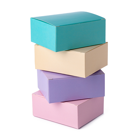
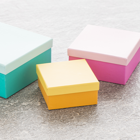
In many businesses, packaging colors are chosen based on the personal preferences of managers. However, it should be noted that packaging colors should reflect the expectations and perceptions of the target audience. For example, pastel tones may be suitable for baby products' packaging, while vibrant and energetic colors may be preferred for sports products' packaging.
Correct: Considering the Demographic Characteristics of the Target Audience
Taking into account the demographic characteristics of the target audience when determining packaging colors is extremely important. Factors such as gender, age group, and geographical region can help determine which colors will be more effective for the target audience. For instance, young consumers tend to be more interested in vibrant colors, while older consumers may prefer softer and pastel tones.
Incorrect: Following Trends Blindly
Businesses that blindly follow trends in the packaging industry may become vulnerable when the popularity of these trends fades over time. For example, a color trend may lose its relevance quickly, leading to your packaging being perceived as outdated. Instead, picking a timeless color palette that reflects the values and identity of the brand is a strategy with a higher potential for success.
Correct: Aligning with Brand Identity
When it comes to packaging color, perhaps one of the most critical points is its alignment with the brand's identity. Choosing a color palette that harmonizes with the logo and other visual elements of the corporate identity is indispensable for maintaining brand integrity. From the consumer's perspective, a consistent brand image in every aspect is equivalent to feelings of trust and prestige.
Incorrect: Ignoring Color Psychology
Disregarding research on how colors influence people's emotions and behaviors is one of the biggest mistakes in packaging color selection. For example, according to studies, red increases excitement and appetite, while blue creates a sense of calm and tranquility. Businesses should consider the message they want to convey with their products and the emotional response they intend to evoke when making color choices.
Correct: Conducting Color Tests
Conducting various tests to understand the color preferences of the target audience before determining packaging color can bring many opportunities. For example, presenting alternative packaging with different color combinations to the target audience and gathering feedback on their preferences can eliminate many uncertainties in choosing the right color.
Choosing the right color or color combination for packaging can strengthen a business's brand image while selecting the wrong color or combination can weaken it. Since the strength or weakness of a brand image directly affects the success of a business in various areas, including sales, choosing the right packaging color is a more critical issue than it may seem. By considering the above recommendations, you can make conscious decisions about the color selection of your packaging and reach your target audience more effectively.
At LuxBoxPack, we provide packaging solutions tailored to the evolving needs of our clients in different sectors. For detailed information about our product range, contact us at +90 212 438 82 15.