The Power of Space in Packaging Design: How Negative Space Directs Attention?
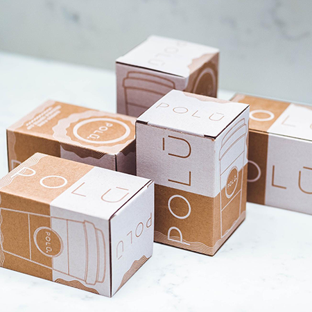
Packaging design is often evaluated through what is visible: colors, typography, imagery, patterns, and surface finishes. Yet there is another component that is at least as decisive as these elements: space. Referred to in design terminology as “negative space,” this element represents what is not present on the package; however, its impact on perception is remarkably strong. Negative space is not merely an aesthetic preference, but also a deliberate tool of guidance.
Negative space encompasses the empty areas left around and between elements in a design. These areas allow the eye to rest, reduce visual clutter, and improve readability. Especially in media with limited surface area, such as packaging, negative space is one of the most effective ways to present information hierarchically. As consumers make decisions within seconds in front of the shelf, the eye naturally gravitates first toward the areas that are easiest to perceive. At this point, space quietly determines where attention will be focused.
One of the most significant functions of negative space is prioritization. A package may contain a great deal of information: the product name, ingredient details, usage instructions, legal statements, brand elements, and more. When all of this information is presented with equal emphasis, perception becomes blurred. Space, however, opens up the area around critical messages, bringing them to the forefront. In this way, the eye follows a guided reading flow rather than getting lost on a crowded surface.
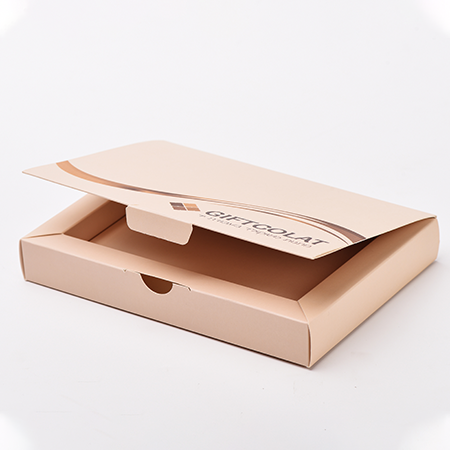
Another significant area of impact is perceived quality. The conscious use of negative space gives packaging a simple, controlled, and reassuring character. Designs stripped of excess reflect the product’s confidence in itself. This approach is particularly effective for functional, technical, or sustainability-focused products, where it reinforces the seriousness and credibility of the message. Here, space is read not as a deficiency, but as an intentional choice.
Negative space is also a silent carrier of brand identity. When a specific “language of space” is used consistently, packaging gradually turns into a distinctive visual signature. That occurs independently of logo size or color intensity. Space does not reveal how a brand speaks, but rather when it chooses to remain silent.
Of course, for negative space to be effective, it must be used in a measured and intentional way, not randomly. Too much space can create a sense of missing information, while too little space suffocates the design. This balance varies depending on the nature of the product, its target audience, and the context of use. Therefore, negative space is not merely an aesthetic decision, but a strategic design parameter.
In short, space in packaging design is an element that often operates unnoticed, yet deeply influences perception. When used correctly, it simplifies the message, directs attention, and strengthens what the package aims to communicate. Because sometimes the most powerful expression lies not in what is said, but in what is consciously left unsaid.
At LuxBoxPack, we provide packaging solutions tailored to the evolving needs of our clients in different sectors. Contact us at +90 212 438 82 15 to get detailed information about our product range.
...
