Many customers and businesses are being victimized as packaging design errors become more prevalent. Even when companies try to pack their products carefully and without damage, problems can arise because of unnoticed factors. The issues caused by poor packaging design include not only product damage but also a negative impression on the visual perception. We have compiled a list of five mistakes in design that you should avoid in the following items.
- Package Design Incompatible With The Size Of The Product
One of the most common errors is selecting the incorrect size of packaging boxes. Packaging boxes that are too large or too small for the size of the product will almost certainly cause damage during transportation. Smaller products in larger packages have a higher rate of impact and impact as well. Compressing large products into small packages results in crushing and explosion damage. You should package each product in packaging that is proportional to its size, not whatever standard you have on hand.
2. Not Using Protective Packaging
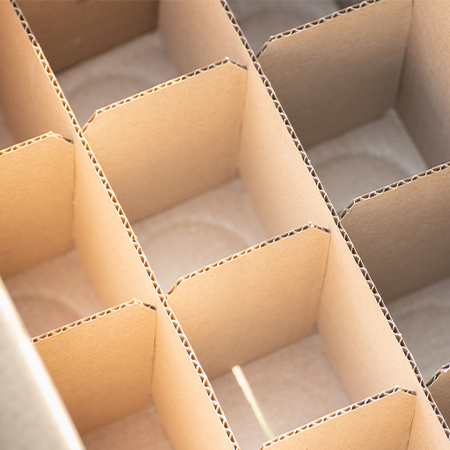
The removal of the aforementioned error does not mean that the problem with the packaging size will be resolved. Because the product will be damaged again if the protective packaging is not wrapped around it in cases such as falling, impact, and impact. Whatever your product is, it is critical to use protective packaging against these risks in order to avoid potential damage.
- Uninspected Packaging
Another design flaw is the incorrect material selection and uncontrolled use of the material. It is also a problem that packages made of unstable materials are not long-lasting. Factors that can cause damage include not being able to carry enough weight and being made of a material that is easily torn and broken. It is necessary to expect and control the problems that may arise as a result of these factors, as well as to ensure that the necessary measures are taken.
- Lack of Attention to Visuality
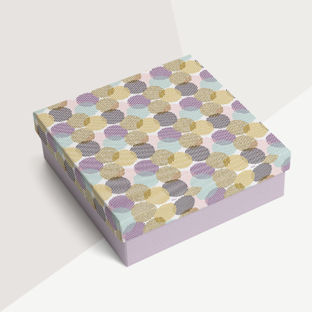
Customers want and expect their products to arrive not only intact but also visually appealing. As a result, by focusing solely on the function of packaging, this element should not be overlooked. Unfortunately, packaging that is too plain, ordinary, and does not satisfy the visual perception will not rise above mediocrity. Designing packaging that will present your product and accurately reflect it will demonstrate how seriously you take your business and care about it.
- Exaggeration in Design
The final point we'll make is about exaggeration in design. Visual appeal is important, but it should be used in moderation for your brand. The items that can be listed, such as the use of colors, the correct typography, and the harmony of the image with the product, must all work together to form a whole.
You can get in touch with LuxBoxPack, which will assist you in standing out from your competitors in the sector by having the right packaging design for your brand and avoiding such issues.
