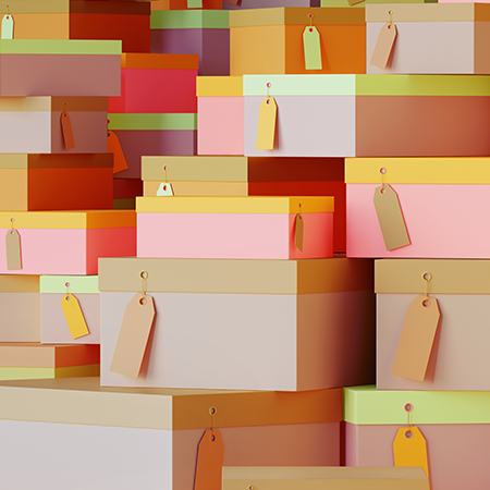
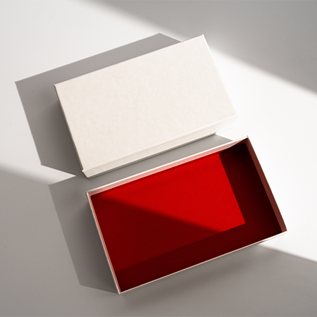
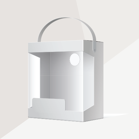
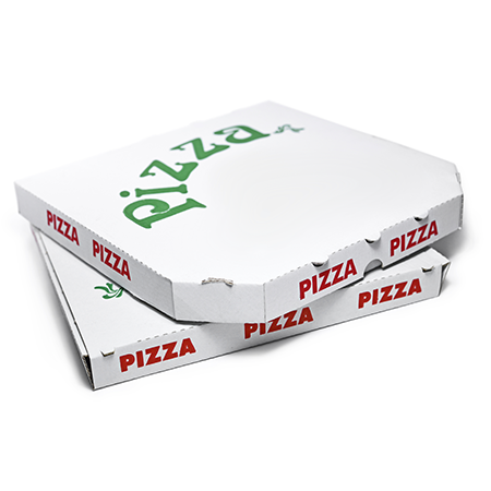
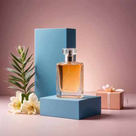
You have many options for your box and packaging designs. You can evaluate many options such as choosing a special design language for your brand and continuing with it, using special days as a theme in your designs, or reflecting the design trends of the period you are in on your packaging. Since your box and packaging designs are important factors that will enable you to communicate with your customers, a careful and careful study will contribute to your brand.
Design Language and Brand
The design language, themes, and approaches you will use have an undeniable effect on the purchase of the product and the feedback after the purchase. When determining your design language, you should first consider and examine your target audience. After determining your target audience, the next step is to consult statistics on this audience's habits and preferences and determine a suitable language for the audience. Apart from determining your design language through these steps, you can determine a variable and up-to-date design language by advancing on trends.
Trends and the Minimal Color Trend
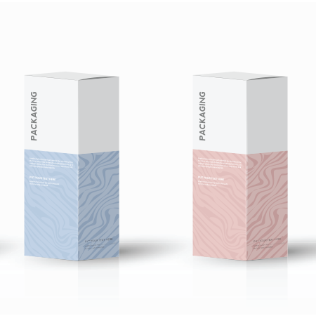
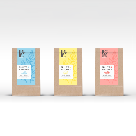
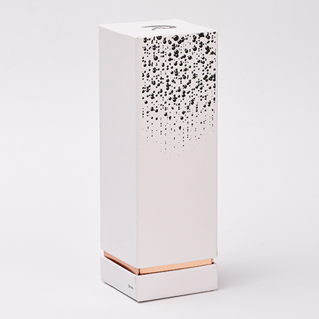
As stated in the previous sub-title, trends are a subject that can cover a large part of your design language studies. In 2022, the minimal color trend in box and packaging designs is one of the most important trends. This trend includes a contrast to too flashy designs with lots of detail and text. It contains items such as the use of one color and minimal text on the packaging. With minimalist packaging, you can eliminate the unnecessary and reveal the essence of the product. The minimalism you will use in color and typography will add a more original atmosphere to your product than other designs. The message you send with a minimalist design will help you to appeal to everyone.
Your Choice of Color and Text on Packaging
Your color and text choices in your minimal packaging designs should be different from your standard designs. The color you choose should be able to summarize what your product promises or evokes on its own, and your text should have a clear and full expression despite its brevity. Your choice of text character and font should support and reinforce the plain and concise narrative.
Conclusion
The care and effort you will show while designing your packaging are directly proportional to the appreciation and satisfaction of your customers. For this reason, it is necessary to approach your packaging designs with care and to do enough follow-up and study on them. LuxBoxPack will help you catch the trends and get the design you need through its experts.
