While many companies seek to supply packaging that shouts "watch out here" to consumers with vibrant colors and bold typography, the opposite trend has recently been on the rise for a simple package design trend. In this blog post, we will focus on the plain package trend.
What Is Simple Package Design
The simple package design is a simplified version of the packages we frequently encounter in daily life. We can say that it is the art of telling what is meant to be told with a simpler design.
Why We Use Simple Package Design?
The perception of "the more, the better", which is the cultural tendency of many people and brands, has begun to replace the philosophy of "simplicity is richness", which has been the German art school "Bauhaus" teaching for a while. Normally, there is a three-second rule to get an item. In other words, it is the time it takes to see a product, read what is written about it, and come to a decision. During this time, brands bombard us with bold and vivid text and different visuals. However, it is more important to be able to explain the originality of the product in such a short period of time and to give the reason why it should be purchased. With these simple package designs, brands give such freedom to their customers.
Things to Consider While Preparing for a Simple Package Design
1. Focusing on the Logo
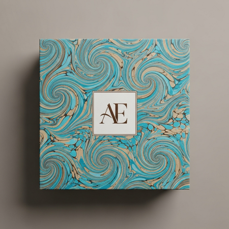
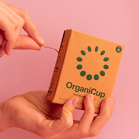
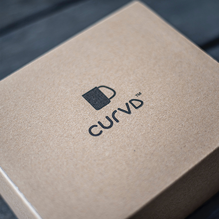
Simplicity in design focuses on need. Since your brand needs recognition, you need a logo, which is your brand's identity. You can choose to put only your logo and a plain background to keep the focus. In this way, your brand will be remembered by your customers and become more recognizable among thousands of brands in the same industry as you.
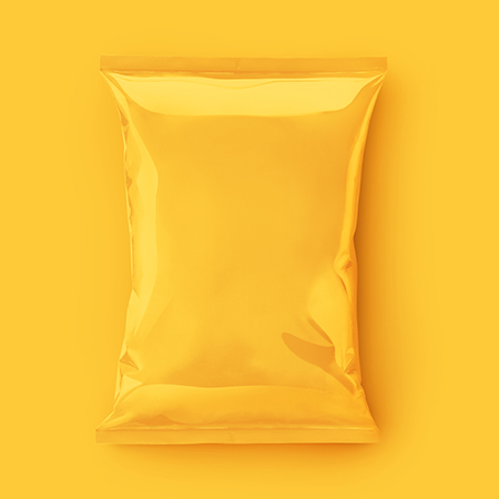
2. Pictures in Monochrome
If your company has a brand color or hue that you usually include in products or social media posts, it's always a good idea to translate it into your packaging.
3. Seeing the product with a semi-transparent packaging
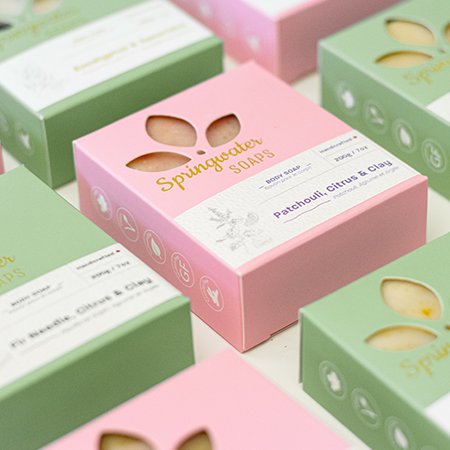
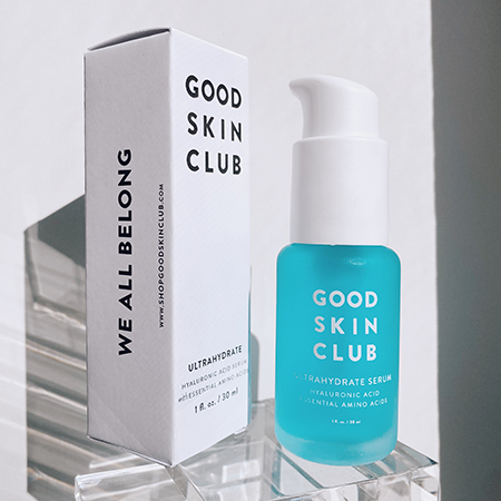
If you want an element of color and excitement while keeping your packaging simple, try transparent or semi-transparent panels. These give your customers a look at your product and make it easier for them to open the box.
4. Less material usage
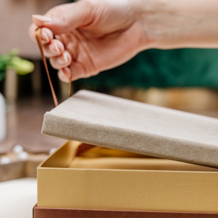
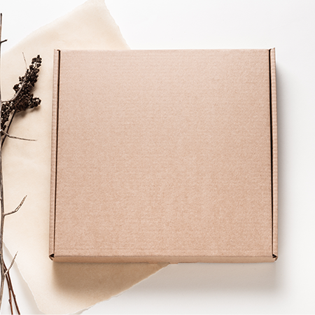
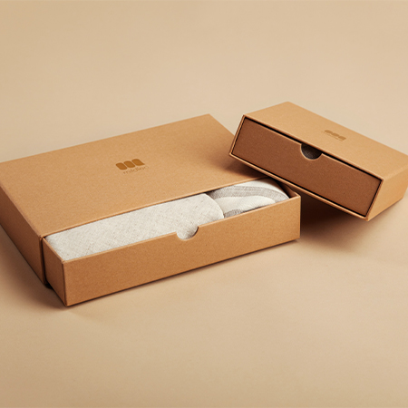
Simplicity can be incorporated not only in the design and aesthetics of your packaging but also in the materials used to make the boxes. Using fewer materials helps you save costs. While doing this, you reduce the amount of waste produced and contribute to sustainability. If you want something aesthetically pleasing but also environmentally friendly, Kraft boxes are your best option.
5. Describe exactly what the product is
For simplicity in design, it is important to weed out and clean all unnecessary items from your packaging. This could mean reducing colors or removing irrelevant information.
Conclusion
If you adopt a simple approach to design, you can tell what your product wants to convey with a simple and confusing discourse, and you can attract the attention of your customers. You can contact Luxboxpack for the designs you will make in this area.

1.jpg)
